12 Instagram Link in Bio Examples You Can Adapt in 2026
The best Instagram link in bio examples do not try to make every destination equally important. They identify why someone just visited the profile, put the most useful next action first, and keep only the links that support that action. The 10-point test for a strong link in bio page gives you a consistent way to judge that clarity before adapting any example.
For a creator, that might mean a new video followed by a newsletter. For a restaurant, it may be reservations, the menu, and directions. For a shop, it could be the current collection, a size guide, and customer support. The design can change; the useful pattern is a clear promise and a deliberate order.
Below are 12 complete examples you can adapt. Each one includes a page headline, suggested button order, and the reason the structure fits that audience. Use the wording as a starting point, then replace it with destinations you actually maintain.
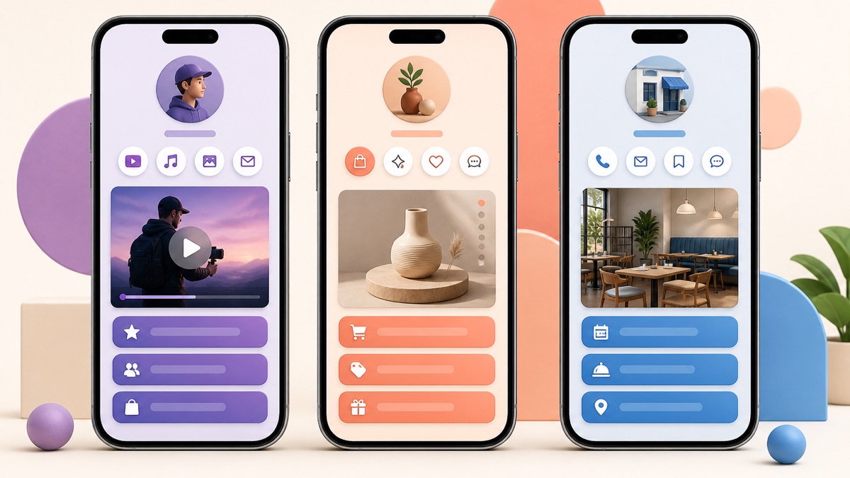
What should an Instagram link in bio page include?
An Instagram link page should usually include:
- a recognizable name and image;
- one sentence explaining what the person or business offers;
- one primary button that matches the current Instagram promise;
- a few distinct supporting destinations;
- a contact route when visitors reasonably need one; and
- secondary social profiles after the task-based links.
Instagram supports up to five profile links, according to Meta's announcement of the feature . Native links are enough when you have a small, stable set of obvious destinations. A dedicated link page is more useful when you need descriptions, visual hierarchy, grouped resources, a changing campaign, or one consistent URL that can serve several social profiles.
Whichever route you choose, do not add links merely because another slot is available. If the order is the difficult part, use this seven-step system for organizing bio links before changing colors or themes.
12 Instagram link in bio examples at a glance
| Instagram profile | Primary button | Useful supporting links | Leave off the first screen |
|---|---|---|---|
| Video creator | Watch the promised video | Free resource, newsletter, full channel | Old uploads |
| Newsletter writer | Read the latest issue | Subscribe, best essay, archive | Every past issue |
| Coach | See coaching options | Case study, fit call, free guide | Unexplained calendar link |
| Freelancer | View selected work | Services, availability, enquiry | Unrelated side projects |
| Photographer | View the relevant portfolio | Session guide, availability, contact | Every photography category |
| Online shop | Shop the featured collection | Bestsellers, size guide, support | Long category list |
| Affiliate creator | Browse the current edit | Disclosure, review method, newsletter | Undisclosed paid links |
| Musician | Listen to the new release | Tour dates, merch, mailing list | Every streaming service as a button |
| Restaurant | Reserve a table | Menu, directions, ordering | Press archive |
| Real-estate agent | View current listings | Valuation, buyer guide, contact | Generic homepage duplicates |
| Nonprofit | Support the current campaign | Impact, volunteer, updates | Internal organization pages |
| Event host | Reserve a place | Agenda, venue, accessibility details | Expired events |
These are page patterns, not performance claims. Your audience may need a different order. The first button should fulfill the promise that brought the visitor from a post, Reel, Story, recommendation, or profile search.
1. Video creator: lead with the content you promised
Page headline: Practical filmmaking lessons for solo creators
Button order:
- Watch: Lighting a Small Room With One Lamp
- Download the Shot List Template
- Join the Tuesday Creator Note
- Browse All Video Lessons
- See My Filming Kit
This structure works when the Instagram post names a specific video or resource. The first button repeats that promise instead of making the visitor hunt through a channel page. The template and newsletter are natural next steps for someone who found the lesson useful. The equipment page remains available, but it does not interrupt the content path.
Avoid labels such as “New video” if the button will still be live three months from now. Use the actual topic, then update the link when the profile promise changes.
2. Newsletter writer: give new readers a sample before the signup
Page headline: One sharp note about independent work every Friday
Button order:
- Read the Latest Friday Note
- Get the Next Issue by Email
- Start With My Essay on Creative Pricing
- Browse the Full Archive
A writer may want subscriptions, but a first-time visitor may reasonably want to read before handing over an email address. Leading with a representative issue reduces that uncertainty. The signup follows immediately, while the recommended essay gives a new reader a better starting point than an undifferentiated archive.
If the Instagram post explicitly offers a newsletter-only download, reverse the first two buttons: put the promised signup or resource first. Match the page to the visit, not to a fixed template.
3. Coach: explain the offer before opening the calendar
Page headline: Career coaching for designers moving into leadership
Button order:
- Compare the Two Coaching Options
- Read Maya's Promotion Case Study
- Book a 20-Minute Fit Call
- Download the First-90-Days Guide
- Ask a Question by Email
An unexplained booking calendar asks a cold visitor to commit before they understand the service. This example puts scope first, relevant proof second, and the call third. Someone who is not ready can still use the guide and remain in the coach's audience.
Keep the proof specific. “Read Maya's promotion case study” tells the visitor more than “Success stories.” Do not imply guaranteed outcomes, and publish a client example only when you have permission to do so.
4. Freelancer: curate the work instead of linking to everything
Page headline: Brand identity and packaging for small food companies
Button order:
- View Three Selected Packaging Projects
- See Services and Starting Scope
- Check September Project Availability
- Send a Project Enquiry
- Read the Studio Process
This is a stronger freelance example than a row of Behance, LinkedIn, Dribbble, email, and a generic homepage. A visitor can see relevant work, understand whether the engagement fits, and enquire without assembling the story across several platforms.
Change “September” when availability changes. A stale month near the top of the page is more damaging than omitting the date. If your work spans unrelated specialties, create a curated starting page rather than placing every portfolio category at equal weight.
5. Photographer: align the portfolio with the post
Page headline: Relaxed family photography in Austin
Button order:
- View Outdoor Family Sessions
- Read the Session and Pricing Guide
- Check Autumn Availability
- Find the Studio and Parking
- Ask About a Session
Someone arriving from a family portrait Reel should not land on a portfolio led by corporate headshots. The first destination continues the visual subject they already chose. Practical information follows before the enquiry, which helps the right person understand the service without an email exchange.
If the photographer promotes weddings and commercial work to separate audiences, use separate campaign pages only when those paths genuinely need different proof, language, and next actions. Otherwise, one page with two clearly named portfolio routes may be easier to maintain.
6. Online shop: feature one current buying path
Page headline: Small-batch ceramics made in Portland
Button order:
- Shop the Autumn Tableware Collection
- See This Week's Bestsellers
- Find Your Mug Size and Capacity
- Read Shipping and Returns
- Ask a Product Question
The shop example is selective rather than catalog-like. The featured collection matches the current campaign, bestsellers give a practical alternative, and buying questions stay close to the product path. The store itself can handle category browsing after the visitor taps through.
Do not place “Shop now,” “Website,” and “New collection” side by side when they all open nearly the same storefront. One specific link is easier to understand and leaves room for support information that removes real uncertainty.
7. Affiliate creator: make the commercial relationship obvious
Page headline: Tested carry-on gear for long train trips
Button order:
- Browse My Current Carry-On Edit
- How I Test and Choose Products
- Read the Packing Guide
- Get the Monthly Travel Note
Place a plain disclosure where visitors will notice it before or alongside commission-earning recommendations—for example: “I may earn a commission from purchases made through clearly marked links.” The exact wording and obligations depend on the relationship and jurisdiction; do not hide the disclosure behind a vague footer link.
The US Federal Trade Commission says material brand relationships should be disclosed clearly and in a place that is hard to miss, and warns against mixing the disclosure into a group of links. Its Disclosures 101 guidance for influencers is a useful primary reference. This example also gives readers the selection method, which is more informative than a wall of products.
8. Musician: organize around the release, not the platforms
Page headline: Lumen Park — new single “Northbound” out now
Button order:
- Listen to Northbound
- See Upcoming Shows
- Watch the Live Session
- Shop the Limited Tour Print
- Join the Mailing List
The first link can open a release page that lets listeners choose a service, rather than using full-width buttons for every streaming platform. That keeps the page centered on the song. Tour dates and the live session extend the same moment; merchandise and email are credible secondary paths.
After the release campaign, update the headline and first destination. A musician's page can keep durable links, but the visual priority should reflect what is happening now.
9. Restaurant: make the visit easy to complete
Page headline: Seasonal Korean cooking in Manchester
Button order:
- Reserve a Table
- View Today's Menu
- Get Directions
- Order for Collection
- Ask About Groups of Eight or More
Reservations lead because they are the restaurant's main Instagram action. Menu and directions are not filler; they answer questions that help a guest complete the visit. Collection and group enquiries serve distinct needs without displacing the everyday path.
Use live destinations. A PDF menu from last season, an expired holiday offer, or a map pin for the old location makes the entire page feel unreliable. If opening hours change frequently, link to the maintained source rather than copying hours into several places that can drift apart.
10. Real-estate agent: split buyer and seller intent clearly
Page headline: Homes and practical market guidance for North Atlanta
Button order:
- View Current North Atlanta Listings
- Request a Home-Value Conversation
- Download the First-Time Buyer Checklist
- See Recent Neighborhood Guides
- Contact Jordan
This page acknowledges two common audiences without alternating between them at every step. Active listings lead, the seller route is named specifically, and a buyer resource supports people earlier in the process. Neighborhood content offers useful context rather than repeating a generic website link.
If Instagram content serves a narrow audience—such as first-time buyers in one city—move that guide or search above the broader listing page. Never present an automated estimate as a guaranteed sale price.
11. Nonprofit: connect the current story to one credible action
Page headline: Help equip 20 community reading rooms this autumn
Button order:
- Support the Reading Room Campaign
- See the Budget and Current Progress
- Volunteer at a Packing Day
- Read Last Year's Impact Report
- Get Project Updates
A nonprofit link page should not rely on emotion alone. The campaign action leads, while budget, progress, and prior reporting give a visitor ways to understand the work. Volunteering and updates remain available for people who cannot or do not want to donate.
Use the legal organization name where needed, send donations to the official secure destination, and make any tax or fund-allocation statements precise for the relevant jurisdiction. Remove the campaign from first position when it closes, even if the final report is still being prepared.
12. Event host: keep logistics beside registration
Page headline: Field Notes Live — a one-day writing workshop
Button order:
- Reserve a Place for 18 October
- View the Full Workshop Agenda
- Read Venue and Accessibility Details
- Meet the Facilitators
- Ask an Event Question
Event visitors need both a decision and reliable logistics. The date belongs in the first button so the action remains understandable outside its surrounding paragraph. Venue and accessibility details should be available before registration, not revealed in a confirmation email.
When the event sells out, change the button honestly to “Join the waitlist” if a real waitlist exists. When it ends, replace the registration path or publish the promised recording. An expired primary button turns a useful Instagram profile into a dead end.
Three page patterns behind these examples
The examples look different, but they use three reusable structures.
One promised action
Use this for a launch, event, download, newsletter, or current piece of content. Put the promised destination first, answer the largest hesitation, and keep the remaining links subordinate. It is the right pattern when most qualified visitors should do the same thing.
Proof before commitment
Use this for coaching, freelancing, photography, consulting, and other considered services. Show the relevant offer and proof before asking for a call or enquiry. A calendar is a tool, not an explanation.
Practical task hub
Use this for restaurants, shops, agents, venues, and organizations whose visitors arrive with several legitimate tasks. Group those tasks in a sensible order rather than forcing one artificial conversion. If you are unsure how many choices remain useful, read the guide to choosing how many links a bio page needs .
How to adapt an example without copying it blindly
Start with the Instagram post or profile promise that sends people to the page. Write down what that visitor expects to find. Then choose one example above with the closest decision path—not simply the closest profession.
Next, replace every button with a real destination and test the label without its surrounding paragraph. W3C's guidance on link purpose in context explains why people should be able to determine what a link will do from its name or associated context. “View family session pricing” is more useful than “Learn more.” For additional wording patterns, see these call-to-action examples for bio page buttons .
Finally, preview the page on a phone and tap every control. WCAG 2.2's Target Size (Minimum) explanation specifies a 24-by-24 CSS-pixel minimum at Level AA, with defined exceptions including sufficient spacing. That is a baseline to understand, not a reason to crowd tiny buttons together. Full-width controls still need clear labels, comfortable gaps, and visible focus.
Instagram link page checklist
Before adding the page to your profile, confirm that:
- the name, image, and one-line promise identify the page immediately;
- the first button fulfills the current Instagram promise;
- each supporting link serves a distinct visitor task;
- vague labels such as “Click here” and “My website” are gone;
- sponsored or affiliate relationships are disclosed where people will notice;
- dates, prices, availability, locations, and campaign status are current;
- every destination loads and matches its label;
- the page is readable and comfortable to use at phone width; and
- expired launches will be removed or reordered on a specific date.
If the content is sound but you need more possible destinations, use the companion list of Instagram bio link ideas for different goals . Examples show how a finished page can be ordered; ideas help you decide what deserves a place on yours.
Frequently asked questions
What is an Instagram link in bio example?
It is a model showing what someone places in the link area of an Instagram profile or on the landing page opened from that link. A useful example includes the audience, goal, button names, and order—not only a screenshot or theme.
Is one Instagram profile link better than five?
Neither number is automatically better. Use one direct link when the profile has one clear, current destination. Use several native links when the choices are few and self-explanatory. Use a dedicated page when the visitor benefits from context, grouping, visuals, or one stable link whose contents can change. Do not fill all five native slots without a reader reason.
What should the first bio link be?
Put the destination that best fulfills the promise that brought the visitor to the profile. That could be a named video, reservation page, product collection, service explanation, registration page, or newsletter. A generic homepage is usually weaker when a specific maintained destination exists.
How often should an Instagram link page change?
Review it after a launch, event, menu change, availability change, or other update that affects the promise. A short monthly link check catches stale destinations on otherwise evergreen pages. Change the order when the reader's likely next step changes, not merely to make the page look active.
Build the path your Instagram visitor expects
Choose the closest example, write the page's one job in a sentence, and put the matching destination first. Then add only the proof, practical details, and secondary routes that help a real visitor continue.
You can build a Belink page and arrange its links in a live preview while adapting one of these structures. Keep the design recognizable, but judge the finished page by a simpler question: can someone arriving from Instagram find the promised next step without guessing?
Instagram, accessibility, and disclosure sources reviewed August 24, 2026.