Link in Bio for Online Course Creators: A Student-Ready Page
An online course creator's link in bio should send a curious visitor to one clear learning decision , not to a wall of platforms. Feature the lesson, course, or enrollment action promised by your current social post. Give new students enough context to decide whether the course fits them, then send ready buyers to the correct sales or checkout page. Keep existing-student access and other courses available, but separate them from the first decision.
A practical first version has a recognizable instructor identity, a featured course or free lesson, a short “who this is for” description, one link to the course sales page, a secondary route for people who are not ready, and a clearly labeled student-login link near the bottom. If you teach several subjects, group courses by the problem a learner wants to solve rather than by the date you recorded them.
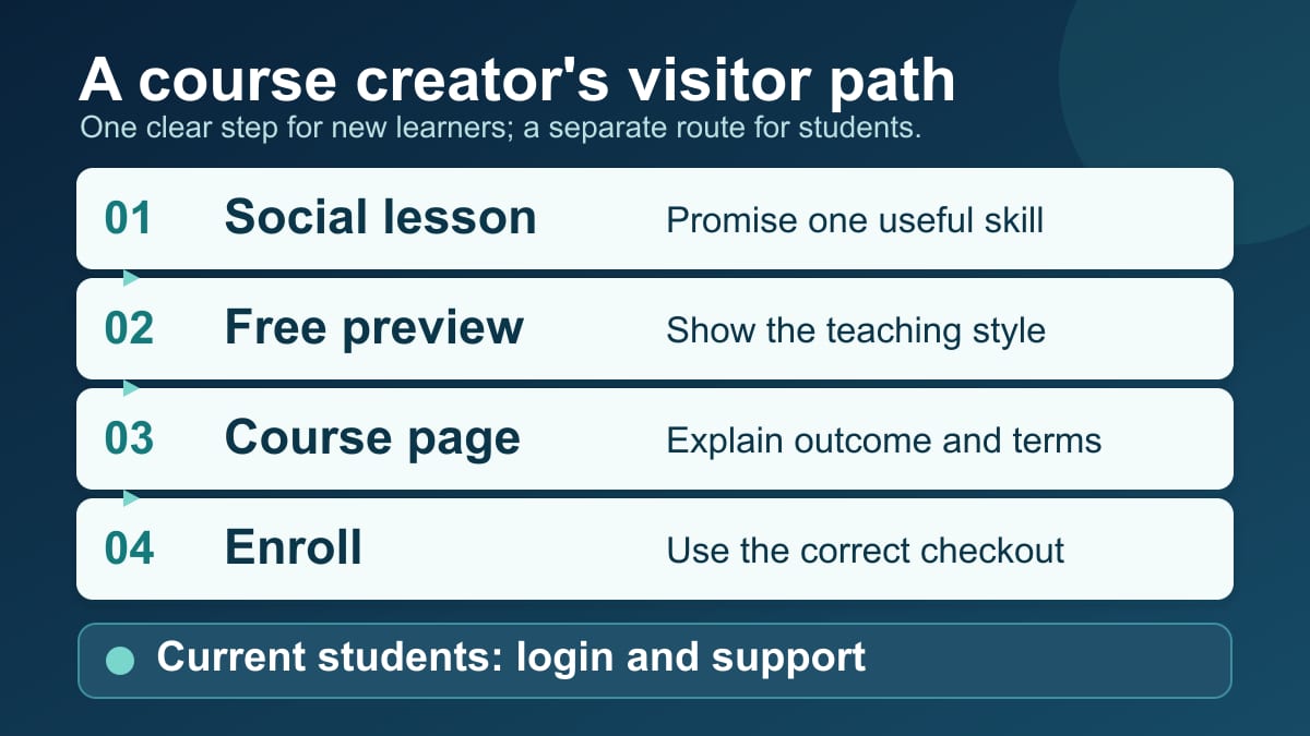
What should a course creator put in a link in bio?
Put the current learner promise first: “Start the free color-grading lesson,” “See the beginner bookkeeping course,” or “Join the next live writing workshop.” Follow it with the destination that explains the course's outcome, curriculum, format, price, schedule, and enrollment terms. Add a free teaching sample when it helps visitors judge your style. Put an existing-student login, support page, and broader course catalog in a separate lower group.
The crucial distinction is between discovery , decision , and delivery . A social video can make someone interested in a method. A bio page can orient that person and choose the right route. The course sales page or platform must make the full enrollment case and handle purchase, access, and delivery. Belink can serve as the routing page; it does not host lessons or replace the course checkout. A compact routing page is only one step in the larger course journey.
That division keeps an educator from trying to fit a syllabus, testimonials, payment policies, and student troubleshooting into six bio buttons. It also prevents the opposite problem: a post promises a specific lesson, but the bio link opens a generic school homepage where the lesson is hard to find.
Match the first button to the lesson that brought the visitor
Imagine a watercolor instructor who posts a thirty-second demonstration of wet-on-wet skies. “Browse all my links” wastes the context the video just created. “Watch the free sky lesson” is a better first button if that lesson is genuinely available. The full beginner watercolor course can follow, with a sales page that explains what students learn beyond the sample.
A coding instructor showing a finished dashboard might need a different path. The post may attract beginners who want a free setup checklist and experienced learners who are ready for a paid project course. Feature the route that matches the post's actual promise. If the video only shows the final project, a course-details page may deserve the top position; a checkout button alone asks visitors to buy before they understand the work.
Write the first button after writing the social-post caption. Copy the specific noun and action the audience just saw. “See the spreadsheet course outline” tells more truth than “Transform your career.” If the page is used across Instagram, YouTube, and email, keep the top destination broad enough to serve all three or change it during a focused launch. One stable bio URL can still lead to a timely first choice.
Do not label an unavailable free lesson as free, or a closed cohort as open. A course-platform status change can make a once-helpful button misleading overnight. Teachable's current publishing and visibility guidance distinguishes a published course from one whose enrollment is closed or student cap has been reached. Check the real destination before leaving a launch button in place.
Give the prospective student enough context before checkout
A buyer needs more than a button named “Enroll.” At a minimum, the route should let them answer five questions: What skill will I learn? Who is this designed for? What will I actually do? How and when do I receive access? What does it cost? The bio page can answer the first two in brief; the linked sales page should carry the detailed curriculum and terms.
Think of a beginner bookkeeping course. The bio page might say, “A four-week introduction to recording income, expenses, and monthly reports for solo business owners.” The course page can then show lesson topics, required software, format, instructor background, price, and enrollment conditions. Someone who only wants a free glossary should have a second route. Someone who already knows the curriculum can reach the purchase step from the course page.
This is not a universal rule against direct checkout links. Teachable describes a product journey in which a student chooses a price on the sales page and completes purchase at checkout, while a shared direct checkout link is another possible entry point ( Teachable student purchase guide ). Thinkific also documents how to copy a checkout link for a published course and a particular price ( Thinkific checkout-link guide ). A warm audience arriving from a detailed email may be ready for that shorter route. Someone arriving from a fifteen-second tutorial usually needs the course explanation first. Test the link as a visitor, including on a phone, before making it the lead action.
Do not publish invented completion rates, income outcomes, or student testimonials to make that decision seem easy. A concrete sample lesson, clear curriculum, accurate instructor credentials, and transparent terms are more useful than a claim that enrollment will change a student's life.
Separate new visitors from existing students
“Log in to class” is important to paying students and confusing to prospects. Keep it on the page, but label and group it as For current students . If a course has a community, assignment portal, replay library, or help desk, put those routes alongside login only if they are live and distinct. Avoid making a first-time visitor click a login button just to discover the catalog.
For a single-course educator, the page might read:
- “Watch the free sample lesson”;
- “See the beginner watercolor course”;
- “Read the course FAQ”;
- “Current students: log in”; and
- “Ask a course-access question.”
The FAQ should address real obstacles, such as required materials, lesson availability, and whether access is self-paced or tied to a cohort. The support link should point to a monitored contact or help page. An empty “Contact us” destination is worse than a plain email route the instructor actually answers.
For a multi-course school, the upper group can feature one current course and a “Choose your starting course” page. The lower group can hold catalog, student login, and support. The bio-page organization framework helps decide which destinations to keep, combine, hide, or remove when a school has accumulated several launches. It should be applied to learner tasks, not merely to an instructor's internal folder names.
Use a layout that follows the stage of your course
A course creator usually needs one of three page states. During a prelaunch, lead with a sample lesson or waitlist that accurately describes what happens after signup. During open enrollment, lead with the course page or relevant enrollment route. Between cohorts, lead with evergreen teaching material and tell people when the next enrollment information is expected if you actually know. Each state can use the same profile URL while changing the first destination and surrounding copy.
The four practical bio-page layouts include a launch pattern and a content-led pattern. For a course, the launch pattern makes the current class obvious; the content-led pattern earns a new visitor's trust through a useful tutorial before asking for a sale. Neither layout can fix a mismatched destination. A beautiful hero card pointing to a closed checkout is still a broken promise.
A cohort-based course also has a date problem. A visitor can arrive weeks after an Instagram post or YouTube tutorial was published. If the promotion states “Enrollment opens Monday,” the page should distinguish the current date and state from the old post. Remove expired countdown language. Link to a real waitlist or next-cohort information only if it exists. If you do not yet have the next date, say so plainly on the destination page.
For an evergreen course, maintain a stable top route and review it when the curriculum, software version, price, or access model changes. The bio page's job is not to duplicate every detail, but it must not contradict the page that handles enrollment.
Choose the right course destination for each button
A general school homepage is useful for someone who already knows the instructor but has not chosen a course. It is rarely the best answer to a post about one specific lesson. A course sales page is useful when the student needs the curriculum, prerequisites, format, and terms. A checkout link is useful when the audience is already informed and the link leads to the correct product and price. A free sample is useful when the teaching style itself is part of the decision.
Do a four-stop link test before publishing:
- Open each button in a private or signed-out window. The visitor should see the promised content without relying on your instructor login.
- Confirm the course and enrollment state. A published page can still be closed to new students.
- Walk the mobile path far enough to see the actual product, price, and next action. Do not assume that a copied admin URL is a public URL.
- Check whether the destination handles the task the button promises. “Course outline” should not jump straight to payment; “Student login” should not open the public catalog.
Thinkific's page URL guidance makes a useful technical distinction: some default checkout paths are dynamic and cannot be visited directly; the creator must copy a checkout link specific to the course and price. The broader lesson applies to any course platform: copy the visitor-facing route and test it, rather than guessing a URL structure.
If your platform has a native course storefront, compare that option against a separate bio page. Our tool comparison by use case explains why someone who wants course checkout, email, and commerce inside one link-page account may choose a different tool from someone who already has a learning platform and needs a simple front door. Belink fits the latter case: links can point to your existing lesson sample, course sales page, enrollment provider, and student support without presenting Belink as the course platform.
Measure the whole enrollment journey, not just button taps
A click from a bio page is a routing event, not a paid enrollment. If you can read aggregate reports from your existing course platform, compare bio-page visitors, course-page visits, started checkouts, completed payments, and refunds with a consistent time window. Keep free enrollments separate from paid enrollments. A surge of sample-lesson clicks may mean visitors like the teaching preview; it does not prove they purchased the course.
Start with a small, practical question. If “See the course” gets visits but almost nobody reaches enrollment, inspect whether the course page answers the audience's objections. If visitors tap a checkout button and return quickly, check whether the link opens the right offer, works on mobile, and matches the price or cohort promised in the post. If the bio-page buttons get little attention, examine the social promise, identity, button wording, and order before redesigning the entire course.
Do not claim that a particular button order raises sales without first-party attribution. Search Console can help identify whether this article attracts relevant discovery, but its clicks do not tell Belink whether a reader signed up, published a page, or paid. Likewise, your bio-page outbound clicks do not automatically identify the course-platform payment that followed. Treat the page arrangement as a testable hypothesis, not a guaranteed conversion formula.
Build a first version that you can maintain
Choose one current course or sample to feature. Write a one-line learner promise that names the subject and level. Add a link to a public course page with full details, then one genuinely different route for people who are not ready to enroll. Put student login and support in a clearly labeled lower group. Open every destination as a signed-out visitor on a phone. Repeat that check when enrollment status changes.
If your course already lives on Teachable, Thinkific, Kajabi, or another platform, you can create a Belink page as a focused front door and link to those existing destinations. Review Belink's current publishing terms before deciding whether the paid publishing option fits your needs. The useful outcome is a visitor who reaches the right next step for their stage of learning; a paid Belink upgrade is sensible only when that public routing page is worth maintaining for your course business.