Best Link in Bio Layouts: 4 Clear Page Structures
The best link in bio layout is the one that makes your visitor's next useful action obvious. For most pages, that means a short identity block, one visually dominant destination, three to six supporting links, and social icons at the bottom. The order should follow visitor intent—not the order in which you added the links.
There is no universal template that fits a creator, a restaurant, a coach, and a product launch equally well. A creator may need a featured video and several content destinations. A consultant may need a booking button and proof of expertise. A launch page may temporarily need one product to outweigh everything else.
This guide compares four practical link in bio layouts, shows when each one works, and gives you a concrete mobile-first structure to build. If your page already exists but the links feel scattered, use our seven-step system for organizing links on a bio page before changing its visual style.
Four link in bio layouts at a glance
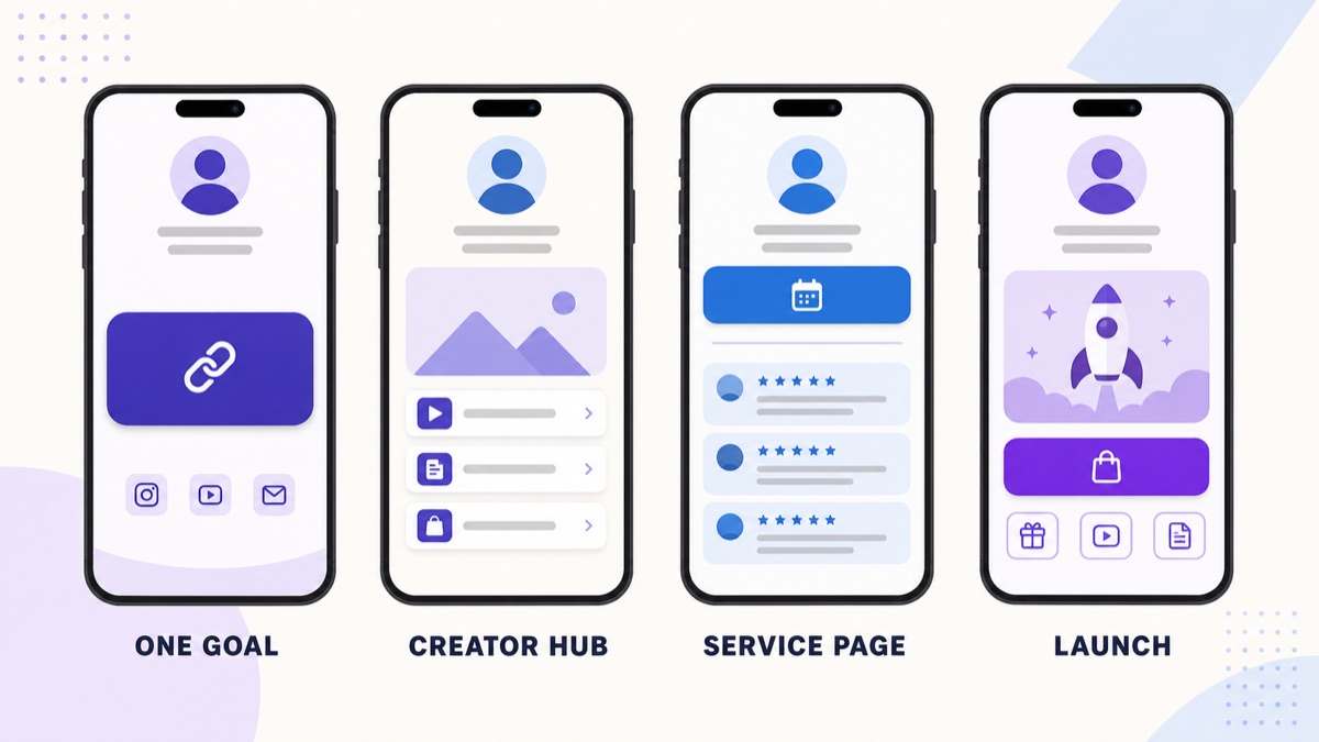
| Layout | Best for | First screen | Main risk |
|---|---|---|---|
| One-goal page | Newsletter growth, waitlists, applications, one campaign | Identity, one promise, one primary button | Too little context for a visitor who does not know you |
| Creator hub | Video creators, podcasters, artists, educators | Featured content, current offer, core channels | Every new upload becoming another permanent link |
| Service page | Consultants, coaches, photographers, local businesses | Service promise, booking or enquiry action, proof | Making visitors research the service before they can act |
| Launch page | Product drops, events, courses, limited campaigns | Launch message, product or event visual, purchase or registration action | Leaving the campaign layout unchanged after it ends |
The key difference is hierarchy. All four pages might contain six destinations, but they should not give all six the same visual weight.
If you are still choosing the platform rather than the structure, compare the best link in bio tools by real use case before rebuilding the page. The right tool should make your chosen hierarchy easier to maintain.
1. The one-goal layout
Use a one-goal layout when nearly every qualified visitor should take the same action. It is the clearest structure for a waitlist, newsletter, job application, event registration, free resource, or focused campaign.
A useful order is:
- recognizable profile image or logo;
- name and one-sentence promise;
- one primary button that names the outcome;
- one sentence that resolves the most likely hesitation;
- one or two supporting links; and
- social icons in the footer.
Imagine a food photographer who is filling the final places in a studio-lighting workshop. The first button should say “Reserve a workshop place,” not “Website.” A portfolio and Instagram profile can remain below it, but neither should look equally important during the campaign.
This layout fails when the visitor needs more orientation. Someone arriving from a broad profile may want to see your work, understand your expertise, or compare several offers before committing. If that uncertainty is normal, use a creator hub or service layout instead of stripping away useful context.
Nonprofits often switch into this layout for one appeal, volunteer drive, or event while keeping service and accountability routes within reach. The nonprofit link in bio guide shows how to preserve those donor, volunteer, service-user, and professional paths without giving every button equal weight.
2. The creator-hub layout
A creator hub works when people arrive for different parts of your work but those destinations still belong to one recognizable identity. It suits a YouTuber with a newsletter and merch, a musician with new releases and tour dates, or an educator publishing across several channels. Musicians can adapt the pattern with the campaign-led order in our link in bio guide for musicians . Podcasters can use it with a tighter listening path; see the complete podcast link in bio setup and button order . Authors can use the same layout to clarify a featured book, retailer choices, series order, and newsletter; the author link in bio guide shows the full reader path.
If Instagram is the main entry point, compare the worked Instagram link in bio examples for creators, shops, and local businesses before choosing the first destination.
Place the most timely or valuable item immediately below the bio. That might be a latest video, a new episode, a current download, or a featured series. Then keep a small set of durable destinations beneath it:
- one featured piece of content;
- one owned-audience action, such as a newsletter;
- one commercial destination, when relevant;
- two or three evergreen channel links; and
- compact social icons.
The creator hub is not an archive. Old launch links, six versions of “latest video,” and separate buttons for every social network make the page harder to scan. Move channel profiles to icons when the destination is obvious, and reserve full-width buttons for actions that need words or context.
For example, a TikTok educator could lead with a promised template, follow with the current course and newsletter, and keep YouTube and Instagram as social icons. The article on turning TikTok attention into a clear next step explains why that conversion path matters even before platform monetization thresholds become relevant.
For a structured course, the course creator link in bio guide shows how to separate a teaching sample, course details, enrollment, and existing-student access without making the page a miniature school website.
3. The service-business layout
A service page should answer three questions quickly: What do you help with? Why should I trust you? How do I start?
For a coach, consultant, photographer, freelancer, or agent, use this order:
- a specific service promise;
- a primary “Book,” “Enquire,” or “View availability” action;
- a short portfolio, case-study, or testimonial destination;
- the most important service options;
- one practical contact route; and
- secondary social links.
A real-estate agent may need a featured listings link, a valuation request, and a contact option. A photographer may need a portfolio, session guide, availability form, and directions to a studio. A restaurant may lead with reservations, then menu, ordering, and directions. Belink's standard links, social icons, media cards, and location links can support these different routes without turning the page into a multi-page website.
Avoid vague labels such as “Learn more” when the destination can be named. “View family-session portfolio” sets a clearer expectation. “Book a 20-minute consultation” is more informative than “Click here.” Descriptive labels also help users understand a list of links out of context; the W3C's guidance on descriptive headings and labels applies the same basic principle to interface language.
4. The launch or storefront layout
Use a launch layout when one product, event, collection, or promotion deserves temporary priority. This is not a permanent “shop everything” page. It is a campaign page with a defined first action.
Start with the launch name and a plain-language description. Follow it with one strong product or event visual, the purchase or registration button, and only the information needed to decide. Supporting links might include sizing, an agenda, frequently asked questions, shipping information, or a relevant demonstration.
Belink does not process product checkout itself; the primary button should send the visitor to the store, ticketing platform, or checkout you already use. That separation can be useful because the bio page stays focused on orientation while the commerce provider handles the transaction.
Ecommerce teams can apply this structure to product posts, collection launches, restocks, and buying guides. The ecommerce link in bio setup guide shows how to choose the right store destination, handle sold-out states, and measure the path beyond an outbound click.
Event teams can use the same launch hierarchy without turning the bio page into a ticketing system. The event organizer link in bio guide shows how to move from ticket launch to event-day details and then to a useful post-event state.
Software teams can adapt the layout around a trial, demo, waitlist, or feature release while leaving deeper evaluation on the product website. The SaaS link in bio setup guide shows how to order product, proof, pricing, documentation, and customer routes without copying the website navigation.
When the campaign ends, replace the expired offer or move it below a current destination. A page that still shouts about a closed event teaches visitors not to trust the top button.
The layout anatomy that all four structures share
Different goals need different blocks, but strong pages usually share a small set of structural decisions.
Identity before options
Show enough identity that a visitor can confirm they reached the right person or business. A recognizable image, display name, and one short line are usually enough. A long autobiography pushes the actual decision below the first screen.
One primary action
“Primary” is a visual and editorial decision. Give the most important action the clearest label and strongest placement. You do not have to hide every alternative, but a visitor should be able to point to the main action without studying the page.
Supporting links in meaningful groups
Group links by the problem they solve: start here, watch, shop, book, visit, or contact. If a page needs more than a handful of links, section headings are better than an undifferentiated stack. For additional examples of hierarchy in practice, see the best link in bio pages and the patterns they share .
Social icons as supporting navigation
Social icons work well for familiar destinations such as Instagram, YouTube, TikTok, or LinkedIn. A labeled button is better when the visitor needs to know what they will find, such as a specific playlist, resource, service, or product.
Design for a thumb, not a desktop cursor
A bio page is commonly opened inside a social app on a phone. Review the real page at a narrow width, not only the wider dashboard around its preview.
Check whether buttons are easy to tap without hitting a neighboring control. WCAG 2.2's Level AA guidance says pointer targets should generally contain at least a 24 by 24 CSS-pixel area, with defined exceptions for adequate spacing and certain inline controls. The full W3C target-size explanation is more precise than treating any one button height as a universal rule. In practice, generous full-width buttons and clear gaps are usually easier to use than tightly packed icon rows.
Text also needs sufficient contrast against its background. WCAG's contrast guidance for normal text sets a 4.5:1 minimum ratio in the usual case, with a lower threshold for qualifying large text. Do not assume a fashionable pastel button is readable because it looks fine on your own screen.
Finally, test the page with actual content. A theme that looks clean with three short demo labels may break when one label wraps to two lines or a product title is longer than expected.
How to choose your layout in five minutes
Write down the one result the page should create during the next 30 days. Then ask what a qualified visitor needs before taking that action.
- If almost everyone should do one thing, choose the one-goal layout.
- If visitors follow different parts of your body of work, choose the creator hub.
- If trust and qualification come before a conversation, choose the service layout.
- If a time-bound offer deserves most of the attention, choose the launch layout.
Next, remove any link that does not support the primary result, answer a necessary question, or provide a credible secondary route. This is where many layouts improve: not through a new color palette, but through a harder decision about what no longer belongs.
Preview the page on mobile. Read only the button labels, from top to bottom. If those labels do not tell a coherent story, rewrite them. The problems described in why most link in bio pages do not convert often begin with unclear priority rather than a lack of design features.
A pre-publish layout checklist
Before you share the page, check each item on a phone:
- The profile image, name, and short promise identify the page immediately.
- The most important action appears before lower-priority navigation.
- The primary button names what happens after the tap.
- Supporting links are current, distinct, and grouped logically.
- Social icons do not duplicate a row of full-width social buttons.
- Tap targets have enough size and space for comfortable use.
- Text remains readable against every button and background.
- Long labels wrap cleanly without hiding their meaning.
- Every destination loads and matches the promise in its label.
- Expired campaigns and old “latest” links are removed.
Belink's live preview makes it practical to test this hierarchy while you build. Choose a theme that fits your identity, but judge the page first by the order, labels, and next action. You can build a Belink page and test one of these layouts without inventing a complex site structure.
Frequently asked questions
How many links should a link in bio layout have?
There is no evidence-based number that works for every page. Start with one primary action and only the supporting links a visitor genuinely needs. A focused campaign may need three destinations; a creator hub may need six or seven. If you keep adding links, introduce groups or remove stale items instead of letting the page become an archive.
Should the most popular link always go first?
Not necessarily. Put the link that best serves the current visitor intent and business goal first. A historically popular video might belong below a registration link during an active workshop launch. Revisit the order when the campaign changes.
Is a grid better than a vertical list?
A grid is useful for visual content that benefits from comparison, such as products or portfolio pieces. A vertical list is easier when choices need descriptive labels or a clear sequence. On a small screen, do not use a grid merely to fit more options above the fold.
Do I need a different page for Instagram and TikTok?
Usually not. One page can work across profiles when the audience and desired next steps overlap. Separate pages make sense when the platforms serve meaningfully different audiences or campaigns—not simply because the traffic comes from two apps.
Start with hierarchy, then style it
Choose the layout from the job the page must do. Lead with one useful action, keep supporting destinations deliberate, and test the result on the device visitors actually use. Once that structure is clear, color, typography, imagery, and theme can reinforce it.
A beautiful page with no priority is still a confusing list. A clear page can be visually expressive without making the visitor solve a puzzle.