Podcast Link in Bio: What to Include and How to Order It
A podcast link in bio page should help a visitor do one of four things: understand the show, play a good first episode, open it in their preferred listening app, or take the next relationship step. Put a featured episode first, listening options second, and durable actions such as a newsletter, membership, or contact link below them.
That order solves a specific problem. Someone who discovers a podcast through a short clip does not arrive with the same context as a subscriber opening a podcast app. They may know the guest but not the show, or remember one quote but not the episode title. A useful bio page bridges that gap without presenting a wall of nearly identical buttons.
This guide gives you a complete podcast link in bio structure, three worked setups, better button copy, and a maintenance routine you can actually keep up with.
What is a podcast link in bio page?
A podcast link in bio page is a short mobile page that sits between a social profile and the places where someone can listen to, follow, support, or contact a podcast. Unlike a single app link, it can serve listeners who use different platforms. Unlike a full podcast website, it is designed for a quick decision from Instagram, TikTok, YouTube, LinkedIn, or a guest's profile.
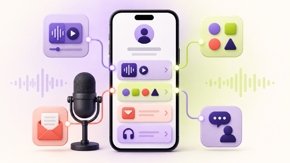
The page is a router, not an episode archive. Apple offers show links, badges, embedded players, and QR codes in its official podcast marketing tools , while Spotify lets creators copy links to either a whole show or an individual episode through its documented sharing workflow . Your bio page gives those destinations a clear order and enough context to choose among them.
The best podcast link in bio order
For most independent shows, start with this structure:
- Show identity: cover image, podcast name, and one sentence about who it is for.
- Featured episode: one timely or beginner-friendly episode with a specific label.
- Listening choices: the two or three apps your audience uses most, plus a broader “Choose your podcast app” option if you have one.
- Owned connection: a newsletter, episode notes, or another way to hear from you outside a listening platform.
- Business or support action: membership, shop, sponsor information, guest pitch, or contact—only when it is genuinely active.
- Secondary channels: video channel and social profiles in a compact final group.
This is a starting order, not a universal formula. A narrative series may lead with a trailer. A daily news show may lead with the latest episode. A consultant whose podcast supports a business may put a useful newsletter above the full app list. The test is whether the first screen matches the promise that brought the visitor there.
If you are weighing several page structures, the creator-hub layout in our link in bio layout guide is the closest general model. A podcast version simply treats listening as the primary job and everything else as support.
Build the page around one listener decision
The most common mistake is designing the page around everything the host has made. That produces buttons for every episode, app, social account, product, guest form, review page, and old campaign. It may be a faithful inventory, but it is a poor introduction.
Instead, finish this sentence before you edit the page:
A person arriving from this week's clip should first __ .
Useful answers include “play the full interview,” “start with the three-minute trailer,” or “choose their listening app.” “See all my links” is not specific enough to guide the layout.
Use one primary action for the current promotion and a small set of durable actions underneath. Our seven-step link-ordering system can help when the page already contains too many competing destinations.
Make the show understandable before asking for a play
The profile block needs only three elements:
- recognizable cover art or host image;
- the exact show name; and
- a one-sentence listener promise.
“Weekly conversations about running a design studio without burning out” tells a new visitor more than “New episodes every Tuesday.” The schedule can be useful, but it does not explain why the show deserves attention.
Avoid copying a long platform description into this space. The page should establish relevance quickly, then let the episode label do more of the persuading.
Feature an episode, not a vague “listen now” button
“Listen now” tells people what the button does but not why this episode is the right one. Pair the action with a subject, guest, or outcome:
- “Hear the 12-minute founder pricing breakdown”
- “Start here: why the city keeps flooding”
- “Play Maya Chen's career-change story”
- “Listen to the season two trailer”
Link to the exact episode when the visitor arrived from a clip about that episode. Link to a trailer or a deliberately chosen “start here” episode when the social profile attracts a broad audience.
Do not quietly replace an episode link with a different destination while keeping old promotional posts live. Someone tapping a six-week-old clip should still reach the episode promised in that clip. If your bio page always features the newest release, give evergreen posts a durable episode URL in their caption, comments, story link, or show-notes page where the platform allows it.
Give listeners a useful app choice
Podcast listeners often have a preferred app because their subscriptions, queues, and playback history already live there. That makes app choice part of the listening path, not decorative social proof.
There are two sensible patterns:
Pattern A: show two or three direct app buttons
Use this when your audience is concentrated on a small number of services and you can keep the links current. Label the buttons “Follow on Apple Podcasts,” “Listen on Spotify,” or “Watch on YouTube” rather than using icons alone.
This pattern makes each destination explicit, but it can consume most of the first screen. Put the featured episode above the app row unless app selection is the purpose of the campaign.
Pattern B: use one universal listening destination
Use a single “Choose your podcast app” button when you already have a reliable destination that detects or lists listening services. This keeps the bio page shorter and leaves space for the current episode and an owned-audience action.
Check the destination yourself on both iPhone and Android. Confirm that the show title and artwork are correct, the major app links open the expected show, and an in-app browser does not strand the visitor. A universal link is only simpler when the intermediate page works.
Whichever pattern you use, do not rank listening services by prestige. Put the audience's practical choices first. If you do not yet have reliable listener data, start with the services you actively maintain, then review outbound clicks and direct listener feedback rather than pretending the initial order is proven.
Add one relationship you control
A play is valuable, but a podcast bio page can also help an interested listener stay connected between episodes. Choose one durable relationship action:
- join the show newsletter;
- read episode notes or transcripts;
- receive a bonus resource mentioned in the episode;
- submit a listener question; or
- follow the show's video channel.
The link should explain the exchange. “Get Friday's five-minute research notes” is clearer than “Newsletter.” “Download the guest's budgeting worksheet” is more useful than “Free resource.”
Do not require an email address just to reveal basic episode information that was promised publicly. The newsletter or download should add value beyond the listening link, and its form should explain what the subscriber will receive.
Handle support, sponsors, and guest pitches separately
These actions serve different people and should not be merged into a generic “Work with us” button.
For listener support, name the arrangement: “Become a monthly member,” “Buy the hosts a coffee,” or “Shop show merchandise.” Put it after the listening action unless supporting the show is the campaign's explicit purpose.
For sponsors, link to a current media kit or a short sponsor inquiry form. State the show's subject and the type of partnership you will consider. Do not publish audience-size or download claims on the bio page unless they come from a defined reporting period you can substantiate.
For guest pitches, set expectations before opening the form. A label such as “Pitch a guest for the climate-tech series” helps reduce irrelevant submissions. If the show is not accepting pitches, remove the button rather than collecting requests nobody will review.
Commercial relationships also need clear disclosure. The US Federal Trade Commission says material connections should be disclosed clearly and placed with the endorsement itself; its current influencer disclosure guidance is a useful baseline when an episode, recommendation, or linked offer involves sponsorship, payment, or free products. A tiny “partners” label at the bottom of an unrelated page is not a substitute for disclosure next to the relevant promotion.
Three complete podcast page setups
The right order becomes easier to see in a real scenario. These examples are blueprints, not performance claims.
1. The interview show promoting a new guest
Profile line: Candid conversations with independent game makers about shipping creative work.
Button order:
- “Hear Ana Ortiz explain her no-crunch launch”
- “Choose your podcast app”
- “Watch the full studio interview”
- “Get the monthly production notes”
- “Suggest a future guest”
The exact episode comes first because social clips feature the guest. The app chooser supports listeners who want to follow the show, while the video version and newsletter offer distinct experiences. The guest form stays last because it does not help most first-time listeners.
2. The expert-led show supporting a service business
Profile line: A weekly operations clinic for owners of small architecture firms.
Button order:
- “Start here: the 20-minute project handoff audit”
- “Follow the show in your podcast app”
- “Download the handoff checklist”
- “Read episode notes and examples”
- “Book an operations consultation”
The free checklist is connected to the featured episode instead of being a random lead magnet. The consultation remains visible, but it does not interrupt the person who came to listen. This is also a case where the link in bio versus website decision matters: the compact page can route social visitors, while a full site holds detailed services, case studies, and searchable episode pages.
3. The member-supported narrative show
Profile line: Reported stories about overlooked buildings and the people who saved them.
Button order:
- “Play the two-minute series trailer”
- “Listen from episode one”
- “Choose another listening app”
- “See photos and source notes”
- “Support the next reporting trip”
A narrative series usually needs sequence. “Latest episode” could drop a new visitor into the middle of the story, so the trailer and first episode lead. Supporting material adds depth after the play decision, and membership comes only after the visitor understands the work.
Write labels that still make sense out of context
A visitor may skim only the buttons. The labels should therefore tell a coherent story without relying on the paragraph above them.
Replace vague labels like these:
| Vague label | More useful podcast label |
|---|---|
| Listen now | Play the new studio-pricing episode |
| Podcast | Follow Field Notes in your podcast app |
| Learn more | Read sources and photos from episode 18 |
| Support | Become a member for bonus interviews |
| Contact | Ask about sponsorships for season four |
Descriptive labels also make the destination clearer for people using assistive technology. W3C's explanation of link purpose in context recommends link text that identifies what the link does from the words themselves or their programmatically determined context.
Keep button labels short enough to scan, but do not cut the meaning to save a few characters. Test the longest label on a narrow screen and confirm that wrapping does not hide the action.
Track the page without confusing clicks with listeners
Outbound clicks can show which destinations people chose. They cannot prove that a person played an episode, followed the show, joined a membership, or became a customer.
Use a simple measurement plan:
- Record bio-page views by source when your setup supports it.
- Compare clicks on the featured episode, app choices, and newsletter.
- Check the destination's own reporting for plays, follows, or signups.
- Change one important element at a time, such as the featured episode or its label.
- Keep campaign dates so you do not compare different promotions as though they were identical.
If you add campaign parameters to links you control, use a consistent naming convention. Do not append tracking parameters blindly to listening-app links if doing so breaks app opening or creates an unexpected intermediate screen. Test the exact published URL.
Most importantly, report each stage honestly. “Thirty people tapped Spotify” is an outbound-click observation. It is not the same as “thirty people listened.” This distinction matters when deciding whether a weak result came from the bio page, the listening destination, or the episode itself.
Maintain the page with each episode release
A podcast page fails gradually. The featured episode stops being current, a membership campaign ends, or a guest form remains open after the season closes. A five-minute release checklist prevents most of that drift:
- update the featured episode title and URL;
- open every listening destination on a phone;
- remove expired launch, event, or sponsor links;
- confirm that newsletter and guest forms still accept submissions;
- review the primary button against this week's social clips; and
- check that all disclosure language still matches the promotion.
Do a deeper review at the end of each season. Decide whether the best entry point is the trailer, episode one, a listener favorite, or a new topical episode. Remove channels you no longer maintain. If the page has grown beyond a clear first screen and a few supporting groups, use the link-count guide to decide what deserves a button and what belongs elsewhere.
Podcast link in bio checklist
Before publishing, test the page as if you found the show through a single clip:
- Can you explain the show after reading one sentence?
- Does the first button match the clip or campaign that sent you here?
- Can you start with a suitable episode rather than an arbitrary latest release?
- Are listening choices clearly labeled?
- Does every show and episode link open the intended destination?
- Is there one useful way to stay connected outside a listening app?
- Are support, sponsor, contact, and guest actions separated?
- Are commercial relationships disclosed next to the relevant promotion?
- Can you scan and tap the page comfortably on a narrow phone?
- Is there an owner and routine for updating it after each release?
Frequently asked questions
Should a podcast bio link go to the latest episode or the whole show?
Use the exact episode when a post or clip promotes that episode. Use the whole show, a trailer, or a “start here” episode when the profile attracts broad discovery traffic. A strong page can feature one episode first and keep a permanent show-follow option immediately below it.
How many podcast apps should I link?
Show the two or three services that matter most to your audience, or use one reliable app-choice page. A long row of app logos can push the actual episode below the first screen. Test the links on mobile and add another only when it serves a real listener need.
Do I still need a podcast website?
A bio page is enough for routing social visitors to listening and relationship actions. A website becomes more useful when you need searchable episode pages, full transcripts, detailed sponsor information, multiple shows, or a larger content archive. Many podcasts use both: a compact bio page for quick decisions and a website for depth.
Can I use the same bio page for every social platform?
Yes, when the audience and first action are similar. If a YouTube audience expects video while an Instagram campaign promotes a specific audio episode, use source-specific links or page variants only when you can maintain them accurately. One current page is better than several neglected ones.
Give the listener one confident next step
A podcast link in bio page does not need to contain the whole show. It needs to preserve the promise that earned the tap, make listening easy, and offer one appropriate way to continue the relationship.
Start with the episode or trailer that fits the visitor's context. Follow it with practical listening choices, then add the newsletter, support, or business action that is genuinely active. You can create a free Belink page and test that order on a phone before placing the link in your profiles.