Link in Bio for Ecommerce Brands: A Product-Led Setup Guide
An ecommerce brand's link in bio should continue the shopping decision that began in the social post. If the post shows one product, put that product first. If it introduces a collection, send people to the collection. If it answers a care or sizing question, lead with the useful guide and keep the relevant product close by. The bio page is the routing layer; the store should still handle product details, inventory, checkout, shipping, returns, and account support.
A practical first version needs a recognizable brand identity, one current featured route, two or three durable shopping destinations, a clear help path, and no expired campaign links. It should make sense to someone opening it inside a mobile browser without asking that shopper to restart the search on a generic homepage.
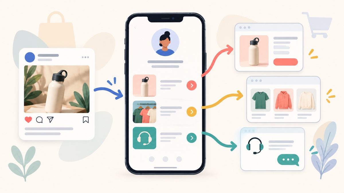
What is an ecommerce link in bio page?
An ecommerce link in bio page is a short mobile page that connects social visitors to specific store destinations. It can point to a featured product, current collection, buying guide, store locator, account area, or customer-support page. It is not a replacement for the ecommerce store, product catalog, or checkout.
That distinction prevents two common mistakes. The first is treating the bio page like a second storefront and copying the whole catalog into it. The second is sending every visitor to the store homepage, even when the post already established a much narrower intent. A useful routing page sits between those extremes: it preserves context without duplicating the commerce system.
For many brands, this is a sensible default order:
- brand name, recognizable image, and one-line product promise;
- the product, collection, or guide promised by the current campaign;
- one secondary route for a shopper who needs a different size, category, or starting point;
- a best-sellers or shop-all route when it genuinely helps discovery;
- sizing, shipping, returns, store location, or support; and
- social channels below the shopping paths.
The order should change with the campaign. A launch, restock, seasonal collection, educational series, and clearance period create different first actions. The URL can stay stable while the top destination changes.
Match the first link to the post that earned the visit
Start with the social post, not the catalog. Finish this sentence:
A shopper who taps after this post is trying to ___ .
“Buy the bottle shown in the video,” “compare the linen colors,” “check whether the jacket comes in tall sizes,” and “learn how to care for the pan” are usable answers. “Visit our website” is not. It describes the brand's destination, not the shopper's task.
Suppose a kitchenware brand posts a demonstration of one carbon-steel pan. The top button should identify that pan or the exact product family. A broad “Shop cookware” button makes the visitor search again. On the other hand, a video comparing three pan sizes may be better served by a collection or comparison guide than by one product page.
The same test applies to a fashion drop. A post announcing a linen capsule should lead to that capsule while it is current. The evergreen “Shop all” route can remain below it. If a creator collaboration features one item, label the item and collaboration accurately instead of using an ambiguous “Get yours” button.
Descriptive link labels are not only better merchandising. They help people decide what a link will do, including people who navigate links out of surrounding visual context. The W3C's explanation of link purpose in context recommends meaningful labels that identify the destination or action.
Keep the bio page, product page, and checkout in their proper roles
The bio page should orient. The product or collection page should explain. The store checkout should transact.
That division gives each page a clear job:
- Bio page: confirms identity, preserves the campaign promise, and offers a small set of routes.
- Product page: shows the correct item, variants, price, availability, images, product information, and store policies.
- Collection page: helps a shopper compare a coherent group of products.
- Checkout: collects the order and payment through the commerce system.
- Support destination: handles order questions, returns, product care, or account help.
Belink can serve as the first routing page. It does not become the merchant of record, manage inventory, or replace the store's checkout. That limitation is useful to state plainly: the article-to-signup path only makes sense for a brand that already has reliable visitor-facing commerce destinations.
Do not paste a private admin URL, preview-only link, or dynamic session URL into the page. Open every destination while signed out and on a phone. Confirm that the promised product, locale, price context, and next action are visible without an employee account.
Choose a destination based on the shopper's decision
The shortest URL is not necessarily the shortest buying journey. Choose the route that answers what the visitor still needs to decide.
| Destination | Use it when | Check before publishing |
|---|---|---|
| Product page | The post features one identifiable item | Correct product, variant choices, current availability, and mobile checkout path |
| Collection page | The post introduces a coordinated range or meaningful comparison | Collection is focused, current, and sorted in a useful way |
| Buying or sizing guide | The visitor needs education before choosing | Advice is current and links to the relevant products |
| Best-sellers page | The audience is broad and wants a safe starting point | The list reflects real current products, not a stale manual selection |
| Store homepage | The post represents the whole brand rather than one offer | The homepage makes the next shopping action easy to find |
| Direct checkout | The audience already knows the exact offer and terms | Correct item, variant, price, region, and a stable public checkout route |
A direct checkout can reduce steps for a well-informed audience, but it can also remove information a new shopper needs. Someone arriving from a detailed email about one fixed bundle may be ready. Someone arriving from a ten-second styling clip may need the product page first.
Shopify's current product-details documentation distinguishes active, draft, archived, and unlisted product states. Other store platforms use different names, but the operational lesson is the same: verify that the destination is intentionally available to the audience before featuring it. A link can return a page and still be wrong for public discovery.
Use a small set of shopping routes, not a copied navigation menu
An ecommerce site's navigation may contain dozens of categories because it serves returning customers, search visitors, wholesale buyers, gift shoppers, account holders, and support traffic. The bio page is narrower. It serves people arriving from the brand's social context.
Begin with one primary route and add a link only if it performs a distinct job. A skincare brand might use:
- “Shop the barrier-care routine”;
- “Find your starting product”;
- “Read ingredient and allergy information”;
- “Shipping and returns”; and
- “Order help.”
Five versions of “Shop now” do not form a usable structure. Neither does a row for every product category. If the page has accumulated too many destinations, apply the seven-step bio-page organization system and remove links that are expired, duplicated, or disconnected from current social content.
Group utility links separately from merchandising. Shipping, returns, order tracking, and contact can sit under a short help heading. They should be easy to find without looking like four competing campaigns. Put account login lower unless the social profile primarily serves existing customers.
Change the leading route as the merchandise state changes
A stable bio URL is valuable only when the page behind it remains current. Build a simple state plan before a campaign begins.
Before a launch
Lead with a truthful preview, waitlist, or launch-information page. State what signing up provides. Do not label a general newsletter as early access unless subscribers will actually receive early access. Keep one evergreen shopping route below the campaign so a new visitor can buy something available now.
During a launch
Feature the launch product or collection and confirm the public destination from a phone. If the offer differs by region, the destination should explain eligibility rather than letting the button make a universal promise. Supporting links should resolve the largest buying questions, such as sizing, ingredients, compatibility, shipping, or returns.
During a restock
Replace “Join the waitlist” with an accurate product route only after the item is available through the linked store. Check variants separately. “Restocked” is misleading if the size or color shown in the post remains unavailable.
After a sellout or campaign end
Remove the purchase wording. Use “Join the restock list” only when a real list exists and the signup explains what happens next. Offer a relevant alternative when there is one; do not quietly redirect a sold-out product promise to an unrelated bestseller.
Between campaigns
Return to a durable structure: current best entry point, core collections, a useful guide, and support. Archive old giveaways, discount codes, countdowns, and “new” labels. The four practical link in bio layouts can help a brand switch between a focused launch page and a broader storefront layout without rebuilding from scratch.
Write button copy that names the product and outcome
Button labels should still make sense when read as a list. Specific nouns carry more useful information than urgency alone.
| Vague label | Clearer label |
|---|---|
| Shop now | Shop the coastal linen collection |
| Learn more | Compare the three pan sizes |
| Get yours | View the refillable travel bottle |
| Click here | Read the leather care guide |
| Sale | Shop the end-of-season edit |
| Contact us | Ask an order or returns question |
Do not add a false deadline to make a label feel stronger. “Last chance” and “almost gone” are factual claims, not decorations. Use them only when the linked offer and inventory support the statement.
The bio-page button-copy guide provides more patterns, but the strongest label usually comes directly from the social post. Repeat the product name or decision the visitor just saw.
Prepare product visuals without changing what is being sold
A bio-page image can help a shopper confirm that the destination matches the post. Use the same product, color, and campaign visual system across the social post, bio page, and store. Do not let an attractive generated or edited image imply a variant, accessory, bundle, or finish that the buyer cannot purchase.
When a product photo needs a cleaner cutout for a campaign card, Belink's sister project Makerr Studio provides background removal and retouching tools . Treat that as a production aid, not a substitute for an accurate product photograph. Check edges, shadows, color, proportions, and included items before publishing. If the edit materially changes how the product looks, say so where the customer makes the purchase decision.
Keep imagery light enough for mobile loading and give it accurate alternative text when the image communicates content. Avoid packing important offer terms into the image; the product name, availability, and action should remain readable as text.
Keep endorsements and promotions honest
An ecommerce bio page often sits beside creator partnerships, affiliate posts, customer reviews, and gifted-product content. The bio link does not erase the disclosure obligations attached to those messages.
The US Federal Trade Commission's current endorsement guidance emphasizes that endorsements must be honest and not misleading and that material relationships should be disclosed clearly and conspicuously. Brands should also follow the rules that apply to their markets, platforms, and audience.
Put the disclosure where a shopper can connect it to the endorsement or affiliate route. A generic policy link at the bottom of a bio page may not explain a sponsored claim made in a video above it. Do not invent customer quotes, review totals, scarcity, environmental claims, or performance results to make the page feel persuasive.
Measure the path beyond the bio-page click
A link click shows that the page routed someone somewhere. It does not prove a product view, add-to-cart, checkout, payment, fulfilled order, retained customer, or profitable sale.
Use a measurement chain that matches the systems you actually have:
- social post or campaign exposure;
- visits to the bio page;
- outbound clicks to product, collection, guide, or support routes;
- store sessions from those destinations;
- product views and cart actions;
- completed orders, cancellations, and refunds; and
- repeat purchase or support outcomes when legitimately available in aggregate.
If the store already uses Google Analytics, consistent campaign parameters can help separate traffic sources. Google's current
custom campaign URL guidance
explains
utm_source
,
utm_medium
, and
utm_campaign
and warns that inconsistent names fragment reporting. Choose a simple naming convention and test the complete published URL; do not add parameters merely to make a report look sophisticated.
Interpret the chain carefully. Many clicks to a sizing guide may reveal a real pre-purchase question, not a failed page. Product-page visits without checkout may point to price, availability, shipping, or offer mismatch. A highly clicked support route may indicate loyal customers—or a problem that merchandising metrics alone will hide.
Belink's search traffic cannot establish paid adoption on its own either. A reader may discover this guide, sign up, build a page, publish it, and later choose a paid option, but that is a hypothesis until first-party attribution connects those stages. Rankings, sales, and paid upgrades should never be promised from one article or button order.
Three practical ecommerce page setups
A limited fashion collection
The social campaign shows one coordinated capsule across several posts. Use this order:
- “Shop the coastal linen collection”;
- “Find your size”;
- “See shipping and returns”;
- “Shop year-round essentials”; and
- “Ask an order question.”
The collection leads because the post sells a range, not one SKU. Size and policy routes support the decision. The evergreen category prevents the page from becoming useless when a campaign item sells out.
An educational skincare campaign
The social video explains a routine rather than one miracle product. Use:
- “Read the barrier-care routine”;
- “Shop the routine”;
- “View ingredients and allergy information”;
- “Start with one product”; and
- “Get product support.”
Education leads because it is the promise that earned the tap. The product route is close, but it does not force a purchase before the visitor understands the routine. Avoid health claims that the evidence and product labeling do not support.
A home-goods restock
The post announces that a previously unavailable lamp is back. Use:
- “View the restocked ceramic lamp”;
- “Check dimensions and bulb requirements”;
- “See the lighting collection”;
- “Delivery and returns”; and
- “Contact order support.”
The product leads only after the public store confirms that it can be bought. When it sells out again, replace the top route and wording promptly instead of leaving “restocked” above an unavailable page.
Run a weekly five-minute maintenance check
Open the published page on a phone and tap every link as a shopper. Confirm:
- the first route still matches the latest important post;
- featured items and variants are genuinely available or accurately labeled;
- campaign dates, discounts, and codes are current;
- product names and images match the store destination;
- shipping, returns, sizing, ingredients, and support pages still resolve;
- tracking parameters preserve a valid public URL;
- sold-out, draft, archived, or unlisted products are not promoted accidentally; and
- the page has not grown into a duplicate store menu.
Do the same check immediately after a launch state changes. Weekly is a maintenance rhythm, not a reason to alter working links without evidence.
When should an ecommerce brand use a bio page instead of its homepage?
Use a bio page when social visitors routinely need several specific, changing destinations and the store homepage does not preserve the context of the post. Use the homepage when it already presents the promised product or collection clearly and no intermediate choice is needed.
The bio page and ecommerce site are not competitors. The page routes a mobile visitor; the store supplies the depth and transaction. Our link in bio versus website guide explains that handoff in more detail.
Build the smallest version that preserves shopping intent
Choose the current post or campaign that matters most. Link its exact public destination first. Add one alternative shopping path, one decision-support route, and one support path. Test the journey from the social profile through the store on a signed-out phone. Remove anything that does not help a shopper choose, buy, or get legitimate help.
If your products already live in a dependable ecommerce store, you can create a Belink page to organize those routes without moving the catalog or checkout. A paid publishing choice is sensible only if the page is useful enough for the brand to maintain; the goal is not more buttons, but a shorter path to the right product decision.