Link in Bio for SaaS Companies: A Practical Setup
A SaaS link in bio page should not imitate the navigation on your product website. Its job is narrower: match the promise in a social post to the next useful product step. For most software companies, that means one primary action—start a trial, book a demo, join a waitlist, or watch the product—and a small set of supporting routes such as pricing, customer proof, documentation, and support.
Put the action promoted by your current posts first. Keep one durable page URL, but change the order when the campaign changes. A feature announcement may lead to a two-minute demonstration; a founder interview may lead to the product overview; a comparison post may lead to pricing or a relevant customer story. Do not send every visitor to a generic homepage and make them reconstruct the promise.
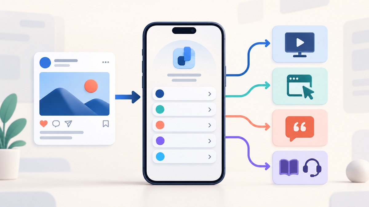
A practical SaaS link order
The right order depends on how the product is bought, but this is a useful starting structure:
| Position | Destination | What the label should answer |
|---|---|---|
| 1 | Current primary action | What can I do after seeing this post? |
| 2 | Product overview or short demo | What does the product actually do? |
| 3 | Pricing or plan explanation | Is it relevant to my budget and use case? |
| 4 | Customer story, example, or proof | Has this worked in a situation like mine? |
| 5 | Documentation, templates, or learning resources | Can I evaluate or implement it properly? |
| 6 | Sign in, support, or status | Where do existing customers go? |
This is a priority list, not a requirement to publish six buttons. An early product with a waitlist may need only three. A mature platform may need grouped routes for evaluators, customers, partners, and developers. The important decision is which visitor the page serves first.
If the page has grown into an unedited collection of releases and resources, use the seven-step system for organizing bio links before adding another button.
Decide which conversion belongs at the top
“Get started” is not automatically the right first action for every software company. The primary button should reflect the buying motion and the promise that brought the visitor to the profile.
Self-serve product
Lead with a trial, free workspace, interactive example, or another real starting point when a qualified visitor can evaluate the product without speaking to sales. The button should describe the state after the click: “Create a free workspace” is clearer than “Get started.”
The next links can answer predictable hesitation: watch a short product tour, compare plans, view a template, and read one relevant customer example. Keep account sign-in lower or visually separate so current users can find it without competing with the acquisition path.
Sales-led product
Lead with “Book a product demo” or “Talk to the team” only when a conversation is genuinely the normal next step. Add a plain-language product overview and enough proof for a visitor to decide whether that conversation is worth having. A meeting link with no context asks for commitment before the visitor understands the product.
If the product serves several industries, do not place six identical “Book a demo” buttons on the bio page. Route to the most relevant solution page or let the website handle qualification after one descriptive demo action.
Waitlist or private beta
Lead with the waitlist and state what the visitor is joining. “Join the reporting beta” is more useful than “Sign up.” Follow it with a short demonstration, an explanation of who the beta is for, and an update channel. Remove old launch links when access opens.
Open-source or developer product
The first action may be “Read the quickstart” or “View the repository,” not a commercial signup. Documentation, a working example, package or repository, community, and hosted-product option can form the core route. Avoid making developers pass through a glossy homepage to reach the technical material named in the post.
Keep the bio page and product website in different roles
The bio page is an editorial front door. The product website carries the deeper explanation, account flow, pricing details, security material, legal terms, and support content. Keeping those jobs separate makes the short page easier to maintain and prevents important information from being reduced to one-line buttons.
Use a direct destination when a post has one obvious continuation. If a video walks through a new reporting feature, its campaign link can open that feature page or demonstration directly. Use the bio page when one permanent profile URL must serve several current posts, audiences, or product stages.
The link in bio versus website guide explains this handoff in more detail. For SaaS, the common path is:
social post → focused bio page → specific product page → trial, demo, or account action
The middle step earns its place only when it reduces uncertainty. A page containing one button labeled “Visit our website” is simply an extra tap.
Write buttons around outcomes, not departments
SaaS navigation often reflects the company chart: Product, Solutions, Resources, Company, Developers. That structure may work on a full website, but it is too abstract for a short mobile page.
Write each button so a visitor can predict the destination:
| Vague label | More useful label |
|---|---|
| Learn more | See how automated reporting works |
| Product | Watch the two-minute product tour |
| Solutions | Explore workflows for support teams |
| Customers | Read the Acme migration story |
| Resources | Download the onboarding checklist |
| Developers | Open the API quickstart |
| Pricing | Compare plans and included usage |
| Contact | Ask a product question |
The W3C's guidance on link purpose in context says users should be able to determine what a link will do from its text or its programmatically associated context. Descriptive labels help people scanning visually, tabbing through links, or hearing a list of links through assistive technology.
Do not add marketing adjectives to compensate for an unclear destination. “Explore our revolutionary platform” still hides the next step. The guide to call-to-action buttons for bio pages can help when the action is correct but the label is vague.
Match the order to the campaign, not every possible audience
One page can remain permanent while its hierarchy changes. Treat the top two positions as campaign inventory.
Feature launch
Use this order:
- watch the feature demonstration;
- try the feature or start the relevant product flow;
- read the release details;
- see a customer or internal example; and
- compare plans if access depends on a plan.
Do not leave a pre-launch waitlist first after the feature is available. Do not send a visitor to a broad changelog when the post promises one specific capability.
Educational campaign
If the social content teaches a workflow, lead with the promised template, calculator, checklist, or guide. Put the product route second and explain the connection without pretending the resource is independent advice when it is promotional.
For example, a scheduling product may publish a short series about reducing meeting handoffs. The first button could be “Download the handoff checklist,” followed by “See the routing workflow in the product.” That sequence respects the original promise while keeping the product path visible.
Comparison or migration campaign
Lead with the relevant comparison, migration guide, or interactive tour. Then provide pricing, implementation detail, customer proof, and a demo or trial. Avoid unsupported “best” claims. Name the criteria and explain the tradeoff a buyer is evaluating.
Event, webinar, or launch-day campaign
Put registration or the live destination first while the event is current. Keep the agenda, speaker information, and product route underneath. Afterward, replace registration with the recording or a useful recap and remove any label that implies the event is still upcoming.
The four practical link in bio layouts show when a one-goal or launch structure is a better fit than a broad business hub.
Three worked SaaS examples
These examples are intentionally specific because “demo, pricing, blog” is not a strategy by itself.
A self-serve design review tool
The company is promoting a video about collecting feedback on a prototype. A useful page could read:
- Create a free review board
- Watch a 90-second review workflow
- Use the product-feedback template
- Compare plans and guest access
- Read the setup guide
- Sign in
The trial leads because the product is self-serve and the post demonstrates the exact workflow. The template gives a cautious visitor a lower-commitment next step. Sign-in remains visible but does not occupy the acquisition position.
A sales-led compliance platform
The company publishes founder interviews and short explanations of audit preparation. A useful order could be:
- See the audit-readiness workflow
- Book a product walkthrough
- Read the implementation overview
- View a customer migration story
- Review security and compliance information
- Customer sign-in and support
The first link explains the product before asking for a meeting. The security route is present because it is part of evaluation, but the short page does not attempt to reproduce a trust center.
A developer tool launching an API
The campaign shows a working integration in a short technical video. The page could lead with:
- Build the quickstart example
- Read the API documentation
- View the sample repository
- Create a test project
- Check usage and pricing
- Get developer support
This visitor is trying to verify that the product can be implemented. A generic “Book a demo” button would interrupt that job. A runnable quickstart is a stronger first action when the product and access model support it.
Use proof without turning the page into an ad wall
One well-chosen proof route is usually enough. Choose the evidence that helps the current visitor decide:
- a customer story for a similar team or use case;
- a working product example;
- a short, current demonstration;
- a migration or implementation outline;
- a public security or reliability resource; or
- a review page that accurately represents genuine feedback.
Do not crop a sentence until it changes its meaning, present an unusual outcome as typical, or reuse a customer name beyond the permission you received. The U.S. Federal Trade Commission's endorsement and review guidance emphasizes honest reviews, non-deceptive claims, and disclosure of material relationships. Other jurisdictions may impose different requirements, so route legal questions to appropriate counsel rather than treating a bio-page checklist as legal advice.
Proof should support the action, not crowd it. A row of customer logos, three review links, five awards, and four case studies creates another research task. Feature the evidence that answers the campaign's main hesitation and leave the full library on the website.
Measure the full journey, not only bio-link clicks
An outbound click shows that the button earned attention. It does not show that the visitor understood the product, completed signup, activated, booked a qualified meeting, or became a paying customer.
Map the observable sequence before changing the page:
- social content view or engagement;
- profile visit;
- bio-page visit;
- destination click;
- trial, waitlist, demo, or documentation action;
- meaningful product activation or qualified sales event; and
- first genuine paid conversion, when attribution supports it.
Use consistent campaign parameters on destination URLs if your analytics setup supports them. Google Analytics documents
utm_source
,
utm_medium
,
utm_campaign
, and related parameters for identifying campaign traffic, and warns that inconsistent naming can fragment reporting in its
campaign-data guidance
. Decide the naming convention once; do not alternate between values such as
instagram
,
Instagram
, and
ig
for the same source without a deliberate reporting plan.
Keep the limitations visible. A visitor may encounter several posts, direct visits, referrals, or sales conversations before buying. Platform reporting can be partial. A click followed by a purchase is not automatically proof that the bio page caused the purchase. Use the evidence to find obvious leaks and compare like-for-like periods, not to manufacture certainty.
A monthly maintenance routine
Assign ownership of the page. A five-minute review prevents a permanent profile URL from becoming a graveyard of launch links.
- Open every destination on a phone without relying on an employee login.
- Confirm the first button still matches the posts currently receiving attention.
- Remove closed waitlists, expired webinars, old launches, and retired feature pages.
- Check that trial, demo, pricing, and sign-in routes still open the intended state.
- Replace outdated customer proof when the underlying product or claim has changed.
- Verify documentation links after a version or information-architecture change.
- Read only the button labels and confirm that each destination is predictable.
- Check campaign parameters for consistent spelling and a real reporting purpose.
- Review support and status routes without making them compete with acquisition.
- Change one variable at a time when testing order or wording.
Run the same review after a major release, pricing change, rebrand, acquisition, migration, or campaign handoff. The URL can stay stable while the editorial priority changes.
Common SaaS bio-page mistakes
Copying the website navigation
A bio page with Product, Solutions, Resources, Company, and Contact has reproduced the header in a less useful form. Lead with the campaign's next action and use descriptive supporting routes.
Making trial, demo, and contact equally prominent
These actions imply different buying motions. Decide which one is normal for the target visitor. Keep alternatives available only when they solve a real second path.
Sending every post to the homepage
The homepage must serve many visitors. A social post usually makes a narrower promise. Route to the specific feature, guide, example, or action that continues it.
Mixing acquisition and customer support
Existing customers need sign-in, documentation, status, and support. Prospective customers need orientation, proof, and a next step. Label or group the two routes so neither audience has to inspect every button.
Treating clicks as revenue
Clicks can diagnose the top of the path. They do not establish product activation or paid adoption. Connect the measurement stages you are authorized to analyze, and label the rest as a hypothesis.
Frequently asked questions
What should a SaaS company put first in its link in bio?
Put the action promised by the current social campaign first. That may be a trial, product demo, waitlist, quickstart, webinar, template, or feature page. Do not default to the homepage when a more specific destination continues the post.
Should pricing be on the bio page?
Link to the current pricing or plan-explanation page when price is a normal evaluation question. Do not copy plan details onto the bio page, where they can drift out of date. Use a label such as “Compare plans and included usage” when that accurately describes the destination.
Should existing-customer links be included?
Include sign-in, documentation, support, or status when customers genuinely use the public profile to find them. Place those links in a clearly labeled group or lower section so they remain available without displacing the primary campaign action.
Does a SaaS company still need a full website?
Usually, yes. The bio page routes short-form social attention. The website supplies product detail, proof, pricing, security information, documentation, legal material, account flows, and support. Use the two together rather than forcing one small page to perform every job.
How often should the page change?
Review it monthly and at every meaningful campaign transition. Update the first action when a launch, event, waitlist, or feature push ends. Keep the permanent URL when it still serves the same product identity.
Build the shortest honest product path
A useful SaaS link in bio page does not explain the entire company. It gives the visitor a confident next step after a specific piece of social content. Choose one primary action, label every destination by outcome, keep proof selective, separate prospects from customers, and measure beyond the first click.
You can create a Belink page , arrange the product routes, and test the complete mobile journey before deciding whether to publish it. Belink provides the routing page; your product website, trial, documentation, sales process, and support systems continue doing the deeper work.