Link in Bio for Small Business: A Practical Setup Guide
A useful link in bio for a small business is a short action menu, not a miniature version of the whole website. Choose the one task that matters most to a customer right now—reserve, book, shop, request a quote, view the menu, or get directions—make that the first obvious button, and keep only the links that help someone complete or trust that action.
A dependable starting order is:
- business name, location or service area, and a one-line promise;
- one primary customer action;
- two or three supporting links, such as services, menu, portfolio, reviews, or directions;
- one maintained contact route; and
- social profiles after the practical actions.
The exact buttons should change with the business. A bakery, hair salon, online shop, and home-repair company do not have the same customer journey. What they share is a need to turn interest from a social profile into a clear next step without making the visitor hunt.
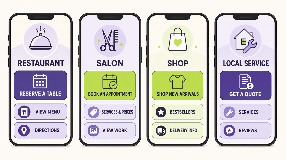
What a small-business link in bio page should do
The page should answer three questions quickly:
- Am I in the right place? The business name, offer, and location or service area should be recognizable.
- What can I do here? The most useful action should be visually and verbally clear.
- What happens after I tap? Each label should describe the destination, not merely say “Learn more” or “Click here.”
That makes the page a routing layer between a social profile and the places where business actually happens. It may route a guest to a reservation system, a client to an appointment calendar, a shopper to a product collection, or a homeowner to a quote form. It does not need to repeat every paragraph, policy, product, and company detail from the main website.
This distinction matters because native profile-link options vary by platform, account, and region, and those options can change. A business should not build its whole customer journey around a remembered platform limit. Instead, decide whether visitors have one obvious destination or several legitimate tasks. Link directly to the single destination when one action is enough. Use a focused hub when customers genuinely need a choice.
Google makes a similar distinction in its own local surfaces. Its current Business Profile guidance separates menu and service links from transactional routes such as booking, reservations, food orders, and shopping orders. A social bio page is not a Google Business Profile, but the underlying editorial lesson is useful: name the customer task and send the person to a destination that can complete it.
Start with one primary customer task
Do not begin by collecting URLs. Begin by choosing the action that would make the page useful this month.
Finish this sentence:
“The right visitor opens this page because they want to ______.”
Good answers are specific:
- reserve a table tonight;
- see haircut services and book an appointment;
- shop the new collection featured in a Reel;
- request a quote for a home repair;
- check class times and claim a trial session; or
- find the shop and confirm today’s hours.
“Explore our business” is too broad. “Engage with us” does not describe a customer task. If the blank needs three unrelated verbs, choose the task connected to the traffic arriving now and treat the others as supporting routes.
The primary task determines the first button. It also gives you a standard for removing links. A button belongs on the page when it helps a qualified visitor complete the main task, answers a necessary question, or offers a sensible alternative. An old campaign, a dormant social account, or a generic homepage link does not earn space merely because the URL exists.
If you are unsure what information belongs on the page at all, first use the broader checklist for what to put on a link in bio page . Then return here and tailor the order to the customer task.
Build the minimum complete journey
The shortest page is not automatically the clearest page. “Book now” may be a strong first button, but a new customer may still need service options, representative work, location, or a cancellation policy before booking. The goal is the minimum complete journey : the smallest set of routes that lets the visitor act without a preventable question.
Use three layers.
1. Primary action
This is the page’s recommendation. Give it the first position and, when the design allows, stronger visual emphasis.
Examples:
- “Reserve a table”
- “Book a haircut”
- “Shop the summer collection”
- “Request a roofing estimate”
- “View this week’s class schedule”
The label should match the destination. Do not write “Get a quote” if the button opens a general homepage. Do not write “Book today” if the destination only explains services and offers no booking path.
2. Decision support
These links help the customer decide whether the primary action is right. A salon might use “Services and prices” and “View recent work.” A restaurant might use “Current menu” and “Directions.” A contractor might use “Services” and “Verified customer reviews.”
Support is different from clutter. Two links that answer distinct questions can reduce uncertainty. Five links to slightly different galleries usually make the visitor do editorial work the business should have done.
3. Practical fallback
Some customers cannot or should not use the preferred route. A maintained phone, email, messaging, or accessibility-information link can provide a useful alternative. Label it with context: “Call about same-day availability” is clearer than “Contact.”
Only offer a channel the business actually monitors. A WhatsApp button creates frustration if nobody checks the number. An inbox without an expected response time may be worse than a simple enquiry form with clear next steps.
Four small-business page setups
These are starting structures, not universal templates. Adapt the order to the promotion, capacity, and customer questions you actually have.
Restaurant or café
Primary action: Reserve a table, order pickup, or view the current menu—choose the one that matches the restaurant’s operating model and current campaign.
Supporting links: Menu, directions, opening hours, ordering, accessibility details, private dining, or a phone route for a specific need.
A reservation-led restaurant might use:
- Reserve a table
- View the current menu
- Get directions
- Ask about private dining
An order-led takeaway should not copy that hierarchy. “Order pickup” may deserve the first spot, followed by the menu, delivery information, and location. If the menu is a PDF, check it on a phone and replace it promptly when prices or availability change.
If a PDF is awkward to read, a mobile digital menu is another option. Belink’s sister site aiMenuu turns an existing menu photo or PDF into an editable mobile-menu draft with QR sharing. Review the dishes, prices, and availability before publishing, then use the menu’s direct URL for your “View the current menu” button. The menu helps guests choose; keep reservations or ordering as separate actions when they use different systems.
Salon, studio, or appointment business
Primary action: Book an appointment or check availability.
Supporting links: Services and prices, portfolio or recent work, practitioner information, location, preparation guidance, and contact for special requirements.
A useful sequence is:
- Book an appointment
- Services and prices
- View recent work
- Find the studio
Avoid separate buttons for every minor service when the booking system already organizes them. The link page should get the visitor into the right booking journey, not rebuild the calendar as a wall of buttons.
Retail or product business
Primary action: Shop the collection connected to the current social content.
Supporting links: Bestsellers, sizing or product guidance, delivery and returns, store location, or customer support.
If a video features a new linen collection, link to that collection rather than the store homepage. The visitor should see the promised products without restarting the search. When the launch ends, replace or reorder the featured link instead of leaving an expired campaign in first position.
Product reviews and testimonials need care. The US Federal Trade Commission’s advertising guide for small businesses says endorsements must reflect honest experience and cannot communicate claims the business could not substantiate directly. A link labeled “Customer results” does not make unsupported claims safer.
Local service business
Primary action: Request a quote, check service-area availability, or book a visit.
Supporting links: Services, representative work, customer reviews, service area, licensing or credentials where relevant, and an urgent-contact route only if the business truly provides it.
A home-repair company might use:
- Request a quote
- View services
- See completed projects
- Read customer reviews
- Check the service area
Do not send a “Request a quote” button to a social direct-message inbox with no instructions if the business actually needs photos, measurements, location, and timing. Link to a short form that gathers the information required for a useful reply.
Write button labels that remove doubt
Button copy is small, but it carries most of the page’s meaning. Replace generic nouns and invitations with a destination or outcome.
| Vague label | Clearer small-business label |
|---|---|
| Website | View our catering services |
| Shop | Shop handmade ceramic mugs |
| Book now | Book a 45-minute haircut |
| Contact | Request a kitchen-remodel quote |
| Location | Get directions to the Shibuya shop |
| Learn more | See class times and prices |
| Latest | View the September workshop |
The W3C’s guidance on link purpose explains that people should be able to understand what a link will do from its text or immediate context. That is an accessibility requirement, but it is also straightforward customer service. A visitor moving quickly through a phone screen should not have to guess where “More” leads.
Keep labels honest. “Check availability” is appropriate if the next screen shows availability. “Guaranteed same-day appointment” is a business claim that requires the business to deliver it consistently. Do not turn a button into an unsupported promise merely to make it sound urgent.
Add the trust needed for the next decision
Trust is not a row of badges added to make the page look busy. It is the specific context a customer needs before acting.
For a local business, that may include:
- a recognizable business name and accurate location;
- current service or product photographs;
- clear prices or an honest explanation of how quotes work;
- maintained opening hours;
- real reviews linked to their source;
- qualifications that are relevant and current;
- delivery, return, cancellation, or accessibility information; and
- a contact route that sets a reasonable expectation.
Place proof near the decision it supports. A “View recent color work” link beside a salon’s booking button is more helpful than a generic testimonials link buried after every social icon. A restaurant’s accessibility information belongs near directions and reservations. A service-area explanation belongs before someone spends time completing an enquiry.
For business links on Google, the company’s current policy requires a dedicated landing page and says an action link should allow the customer to complete the named action. Even when you are linking from social rather than Google, that continuity is a sound quality check: the destination should recognize the same business, repeat the promise, and let the visitor continue.
Keep the bio page and website in their proper roles
A link in bio page can be the right starting point for a new, focused business. It can also remain useful after a full website exists. The two formats solve different problems.
Use the bio page to prioritize current actions from social traffic. Use the website for depth: service pages, product catalogs, articles, policies, case studies, support, complex transactions, and information that needs a permanent address.
A neighborhood bakery might send social visitors to a bio page with “Preorder weekend pastries,” “View today’s counter menu,” and “Get directions.” Its website can hold catering information, allergy policies, wedding enquiry details, and an archive of seasonal collections. The bio page routes. The website explains.
The detailed link in bio versus website guide helps decide whether the business needs one, the other, or both. Whichever structure you choose, avoid unnecessary middle steps. If a post promotes one product and you can link directly to it, forcing a visitor through a hub that repeats the same option adds no value.
Test the page on a phone before sharing it
Small-business pages often look tidy in an editor and fail in the real journey. Test from the social profile while signed out, on a phone, and using the same network conditions a customer might have.
Check these points:
- The business identity and primary action are visible without careful reading.
- The first button matches the post or profile promise.
- Every destination loads and belongs to the correct business or location.
- Booking, ordering, quote, and payment flows can be completed without an account when that is the intended customer experience.
- Menus, portfolios, forms, and policies are readable on a small screen.
- Back navigation returns the visitor to a usable page.
- There is no expired offer, wrong phone number, closed calendar, or outdated address.
Also check tap targets and spacing. WCAG 2.2’s minimum target-size guidance uses a 24-by-24 CSS-pixel minimum with defined exceptions and spacing alternatives. A small-business page can go beyond that baseline with comfortable full-width buttons and enough space to avoid accidental taps.
When the page is live, use the 10-point link in bio quality test for a stricter review of identity, promise, priority, continuity, labels, structure, trust, mobile use, destinations, and maintenance.
Maintain it like an open storefront
A broken link in a personal archive is annoying. A broken reservation, order, or quote link can stop a customer journey at the moment of intent.
Set a simple maintenance rhythm:
- Weekly during an active campaign: confirm the featured offer, stock, event, or availability is still current.
- Monthly: open every link on a phone, remove expired promotions, and check business hours, prices, and contact routes.
- After any operational change: update the bio page alongside the website, booking system, menu, address, or service-area information.
- Quarterly: review whether the first button still reflects the most valuable customer task.
Use click analytics as a question generator, not a verdict. A low-click link may have a weak label, poor position, little relevance, or a destination people do not trust. A high-click link may simply be the first button. Change one variable at a time and judge the whole path by meaningful outcomes such as completed bookings, qualified enquiries, orders, visits, or calls—not by clicks alone.
If the list grows messy between reviews, use the seven-step link organization system to keep, hide, combine, or remove each destination deliberately.
Common small-business link in bio mistakes
Sending everyone to a generic homepage
A homepage is appropriate when it is the best continuation of the social profile. It is wasteful when a visitor must reopen the navigation and search for the menu, product, service, or event they were just promised.
Giving every button equal weight
Equal styling and a random order make the customer decide what the business should recommend. Give one current action priority and make the remaining links support it.
Copying another industry’s setup
A restaurant needs reservations, menu, location, and ordering. A consultant may need services, case studies, and an enquiry route. Copy the decision principle, not the exact buttons.
Publishing proof without context
Awards, reviews, portfolio images, and credentials help only when they are real, relevant, and connected to the decision. Avoid vague badges, unverifiable superlatives, and screenshots with no source.
Treating the page as finished forever
The business changes. Offers end, staff availability moves, products sell out, and URLs break. A maintained page signals care because it remains accurate, not because it receives constant cosmetic redesigns.
A 30-minute setup plan
If you are building the page today, use this sequence:
- Write the primary customer task in one sentence.
- Choose the destination that completes that task.
- Add no more than three links that answer necessary questions or provide a useful alternative.
- Write labels that name the outcome of each tap.
- Add the business identity, location or service area, and a maintained contact route.
- Test every destination from the actual social profile on a phone.
- Ask someone unfamiliar with the setup what they would tap first and what they expect to happen.
- Remove or rewrite anything that makes their answer uncertain.
You can build this structure with any tool that supports the destinations and presentation the business needs. If you use Belink, create the page around the primary customer action , preview the finished order, and share the public URL only after the full journey works.
Frequently asked questions
What should a small business put in its link in bio?
Start with the business identity and one primary action. Add only the supporting links a customer needs to complete or trust that action: services or menu, prices, portfolio, reviews, directions, practical policies, and one maintained contact route. Put social profiles after customer tasks unless following another channel is the page’s main purpose.
How many links should a small business bio page have?
There is no universal number. Use the fewest links that create a complete customer journey. A campaign page may need one primary button and two supporting links. A restaurant with reservations, menu, ordering, directions, and accessibility information may need more. Distinct, useful routes matter more than a quota.
Should the bio link go to the homepage?
Only when the homepage is the best next step. Link to the specific menu, booking page, product collection, service page, event, or quote form when the social content already establishes that intent. Do not make a customer restart the search.
Can a link in bio page replace a small-business website?
It can be enough for a narrow offer with a small number of customer tasks. A website becomes useful when services, products, policies, proof, search content, or transactions need separate pages and deeper navigation. Many businesses should keep a focused bio page as the social front door to a larger website.
How often should a business update the page?
Update it whenever the main offer, availability, hours, location, menu, pricing, or campaign changes. Test every destination monthly, and check more often during launches or time-sensitive promotions.
Make the next customer action obvious
The strongest small-business bio page is not the one with the most destinations. It is the one that understands why the visitor arrived and gives that person a complete, credible path forward.
Choose one task. Name it clearly. Add only the proof and alternatives the customer needs. Then maintain the page with the same care you give an open storefront.