Link-in-Bio Launch Checklist: Test Every Visitor Path
A link-in-bio page is ready to launch when a new visitor can understand the offer, choose a useful next step, and reach the correct destination on a phone. Check the published page from the actual social profile, test every link while signed out, and confirm that the most important action is visible without hunting. A polished editor preview is only the beginning of that review.
This link-in-bio launch checklist is for creators and small businesses preparing a campaign, product announcement, event, or refreshed profile. It focuses on the journey after someone taps. You can use it with a link in bio page built in Belink or apply the same checks to an existing public landing page.
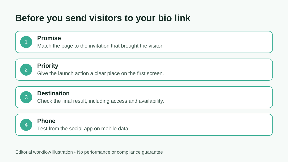
Review the visitor journey in order: promise, priority, destination, and phone experience.
1. Write the promise before arranging the buttons
Copy the sentence that sends people to your bio link. “Book a consultation,” “see the new collection,” and “get the workshop details” create different expectations. The first screen of the destination should continue that same promise.
If an Instagram caption advertises a workshop, a visitor should not land on a page where the workshop sits below six unrelated offers. Put the relevant action near the top while the campaign is active, and label it with the event name or outcome. When several campaigns are running, make the available choices obvious without pretending they are equally important.
Use one short introduction to explain who the page belongs to and what visitors can do there. A slogan can support the introduction, but it should not replace basic orientation.
2. Choose one primary action
Identify the action that matters most for this launch. That might be reserving a place, viewing a portfolio, booking a call, or reading an important announcement. Give it visual priority and an understandable label.
Secondary actions can remain available, but each should justify its place. An outdated promotion, duplicated shop link, or rarely used platform can distract from the campaign. The guide to organizing links on a bio page provides a broader framework for deciding what belongs together.
Do not remove a useful fallback just to make the page look minimal. A contact route can help when a booking service fails. The aim is a clear hierarchy that reflects visitor needs, not the smallest possible button count.
3. Audit the exact destination of every link
Open each button and record the final page it reaches. Check for old domains, typing mistakes, expired documents, draft URLs, unavailable products, and unnecessary redirects. A successful HTTP response alone does not prove that the correct offer is still available.
Use a signed-out or private browser for this test. A document that opens for its owner may ask everyone else to request access. A calendar can display a working page but no bookable slots. A shop may show the right product but the wrong country, currency, or variation.
Check the back journey too. After viewing a destination, can a visitor return to the bio page without losing their place? Test a browser back button rather than assuming everyone will open another tab.
4. Make the labels describe the next step
“Start here” is understandable only when the surrounding explanation makes the action clear. “Book a 20-minute introduction” gives more information. “Portfolio: recent restaurant projects” is more useful than another button called “Website.”
Keep the words accurate to the destination. Do not label a general store “Download the free guide,” or make an enquiry form look like an instant reservation. If the next page requires an account, payment, or a separate application, communicate that before the visitor invests effort.
Google's link-text guidance also recommends descriptive anchor text with useful surrounding context. For a launch checklist, the practical benefit is simpler: visitors know what a tap will do.
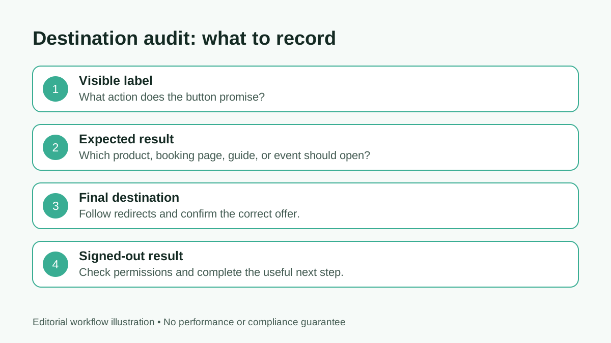
Record the result a visitor sees, not only the URL entered in the editor.
5. Test inside the social app
Open the live profile on your phone and tap its bio link. Many visitors will arrive through an in-app browser. That experience can differ from the desktop browser you used to build the page.
Look for clipped headings, controls hidden behind browser chrome, keyboard problems, and external services that refuse to load. Test important forms and booking links far enough to confirm that the next step works, without making a real purchase or submitting a duplicate enquiry.
Try mobile data as well as office Wi-Fi. Large images can make a page appear incomplete on a slower connection. Essential identity and button labels should remain understandable while visual assets load.
6. Check readability and access
Read the page at a normal phone size and with larger browser text. Headings should wrap sensibly, buttons should stay separate, and the visitor should not need horizontal scrolling to find a destination.
Review contrast on the actual background, including photographic areas. Do not rely on color alone to distinguish the main action. The W3C's design accessibility tips are a useful starting reference for legible text, identifiable controls, and alternative descriptions.
Treat accessibility as a practical review, not a claim of certified compliance. If the launch has formal accessibility requirements, arrange an appropriate audit. Basic phone checks still catch many avoidable issues before visitors arrive.
7. Confirm the identity and preview
Check the public name, avatar, introductory line, and contact details. A cropped profile picture can lose the feature that makes a business recognizable. Use assets that still make sense when displayed small.
Paste the live page URL into the sharing channels you plan to use. Confirm that the preview represents the current page rather than an old offer. Social platforms can cache previews, so a stale image does not necessarily mean the public article or profile has failed to update.
Keep a simple inventory of the places where the bio URL appears: social profiles, pinned posts, QR materials, email signatures, and partner listings. Update the source entry if the destination has changed.
8. Decide what success means
Choose a result connected to the launch: qualified enquiries, workshop registrations, product visits, or completed bookings. A page view or button click is an intermediate action, not automatically a sale.
If your destination platform supports campaign parameters, use a consistent naming convention and verify that the final page preserves them. Avoid placing names, email addresses, or other personal information in URLs.
Do not assume Belink or an external service measures every step automatically. Confirm what your current setup actually records. A modest, trustworthy measurement plan is more useful than a dashboard with numbers whose meaning is unclear.
9. Assign an owner and an expiry review
Someone should know which offer is current and be responsible for checking it. Record who can edit the page, who approves campaign changes, and when time-sensitive links need review.
For an event, set a review after registration closes. For a product launch, check stock and availability. For a seasonal promotion, replace the offer when its terms end. The earlier small-business link-in-bio guide shows how contact, service, and campaign links can work together.
Keep an approved previous version or a short record of changes. That makes it easier to recover the correct wording when an update goes wrong.
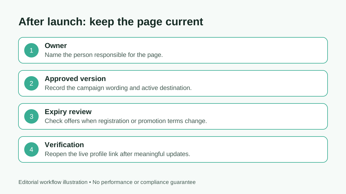
Ownership keeps a launch page useful after the first wave of traffic.
A final go-live check
Ask someone who did not build the page to open it from the social profile. Give them the same task a customer would have: find the workshop price, book a consultation, or view the newest collection. Watch where they hesitate.
Fix confusing labels and incorrect destinations before changing decorative details. Then repeat the important journey on the published page. The link-in-bio layout guide can help if the remaining problem is hierarchy rather than a broken destination.
FAQ
Should I test the preview or the published page?
Test both, but make the final decision from the published page reached through the real profile link. That includes redirects, permissions, and the in-app browser.
How many links should a launch page have?
Use enough to complete the visitor's task and provide useful alternatives. Prioritize one launch action and remove expired or duplicated destinations.
Does a working link prove the campaign is ready?
No. The correct offer must be available, understandable, and usable while signed out on a phone. Test the whole path.
When should I review the page again?
Review it whenever the offer, destination, price, availability, or campaign changes. Assign a specific owner so that review actually happens.